Quick-use Toolkit


Primary Colors

#0CB4CE
TECHY TURQUOISE

#2E3192
ROYAL AZURE

#231F20
BLACK

#2E3192 – #0CB4CE
GRADIENT BASE
Font Size

When creating logos, it’s important to take note of three things: typography, primary colors, and font size. For example, our typography uses Coco Gothic in both Bold and Light. The Bold format is used to emphasize while the Light is used as a supplementary to the text in Bold. This coincides with the font size. Different font sizes should be considered and measured depending on what needs to be seen in the logo. Primary colors should always be planned scheme or color psychology. Depending on the audience or the design you want to invoke, the color scheme should complement to the planned concept.


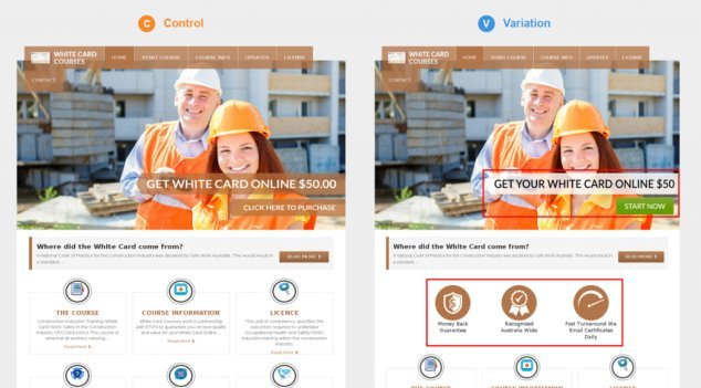
Slide for the before & after
Clear Area
Clear Area or Clear Space is the term used to describe the specific amount of area or space that a logo has on all sides regardless of use. The amount of clear area should also fall in line with the concept. For example, if you plan to use a minimalist approach, the clear area shouldn’t take too much space.
Pitfalls and Best Practices
There are do’s and don’ts in making logos that have been considered as professional practice. These guidelines are commonplace in the industry due to the fact that is has been measured to affect psychological response, audience retention, and overall design impact.

![]() Distorting the logo is prohibited
Distorting the logo is prohibited

![]() Altering the typeface of the logo is strictly prohibited
Altering the typeface of the logo is strictly prohibited

![]() Changing the logo color is strictly prohibited
Changing the logo color is strictly prohibited

 Any form of rotation to the logo is strictly prohibited

![]() Turning the logo into an outline is strictly prohibited
Turning the logo into an outline is strictly prohibited

![]() Using the wordmark without the icon is strictly prohibited
Using the wordmark without the icon is strictly prohibited

![]() Turning the icon into a solid color is strictly prohibited
Turning the icon into a solid color is strictly prohibited

![]() Recreating the form and shape of the logo itself is strictly prohibited
Recreating the form and shape of the logo itself is strictly prohibited

Space to breathe![]()
Just like your lungs, every logo should contain space to breathe. This means the space should be just right. Make it too narrow or too wide and you’ve got yourself a lung disorder.
There’s Something Missing![]()
A logo must contain both text and image together to make it memorable. Customers might scroll past your logo if it’s missing one part.

Appropriate backgrounds![]()
In every design template, the background should always match your logo in concept. No matter how beautiful the scenery is, if it doesn’t match your logo’s idea, it shouldn’t be used.
Perfectly Fitting
Taking the clear space into consideration, the logo used should have enough space when being viewed with the clear area. Too much or too little can overpower the logo when viewed.
Like Hands in Gloves
A logo makes an impact if text and image are created in harmony. Customers will instantly recognize your business name and logo if they are always seen together

Appropriate backgrounds
Similar to sceneries, background colors shouldn’t drown your logos into nothingness. Appropriate or complementing colors should always be used wherever the logo is placed.


Slide for the before & after